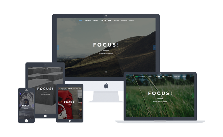
Responsive Layout

A responsive design automatically adapts itself to a particular viewing environment such as desktop, tablet or mobile, without the need for separate layouts for varying platforms

image

About Myriad

Myriad centers around photography, providing an elegant space for displaying full width galleries. The structure, whilst focusing on images, maintains a refined and conservative style option.

The theme makes uses of animated effects to add depth and character to content, without compromising on usability and professionalism. A series of bounce and slide effects are built into Myriad, as triggered by scroll events, with an option to disable them.

A responsive layout adapts automatically to the viewing device's width, such as mobile, tablet or desktop, without the need for a separate layout or content. Mobile modes have a unique menu to aid usability. 960px and 1200px fixed layout options are also available.

Read the Whole Story

More About Myriad

From Our Blog

The Layouts panel in the Myriad template administration interface provides several options for configuring the layout of the template. Each modular section of the template design offers six module positions by default.

Note: If no modules are published to a position, the entire area or row will not appear or collapse.

Header

A B C D E F

Slideshow

Drawer

Top

A B C D E F

Showcase

A B C D E F

FullStrip

FirstFullWidth

Breadcrumb

Feature

A B C D E F

Utility

A B C D E F

SecondFullWidth

MainTop

A B C D E F

ExpandedTop

A B C D E F

Content Top

A B C

Mainbody

Content Bottom

A B C

Sidebar

A B C

ExpandedBottom

A B C D E F

MainBottom

A B C D E F

ThirdFullWidth

Extension

A B C D E F

Bottom

A B C D E F

Footer

A B C D E F

Copyright

A B C D E F

Debug

Analytics


Documentation: Gantry Framework Layouts

Demo Info

All demo content is for sample purposes only. All content images are freely available from Unsplash.

Use the RocketLauncher to install a demo equivalent onto your site.